Making SB You Sites Mobile-friendly
SB You, the personal web publishing tool powered by WordPress, has built in functionality to allow you to easily create a site that will look great on any device: desktop or laptop computers, tablets, or mobile devices. This flexibility is called "responsive design."
SB You, the personal web publishing tool powered by WordPress, has built in functionality to allow you to easily create a site that will look great on any device: desktop or laptop computers, tablets, or mobile devices. This flexibility is called "responsive design."
Responsive Themes
To easily make your site responsive, chose one of these responsive and mobile ready themes:
- SBU 2011
- SBU 2012
- SBU 2013
- Twenty Eleven
- Twenty Twelve
- Twenty Thirteen
- Daily Journal
- Divi
- Fable
- Infoist
- Magazino
- Nexus
- Noteworthy
- Publish
- Reddle
- Responsive
- Vertex
When you do so, the site will automatically adjust to the size of the screen. Here's an example:
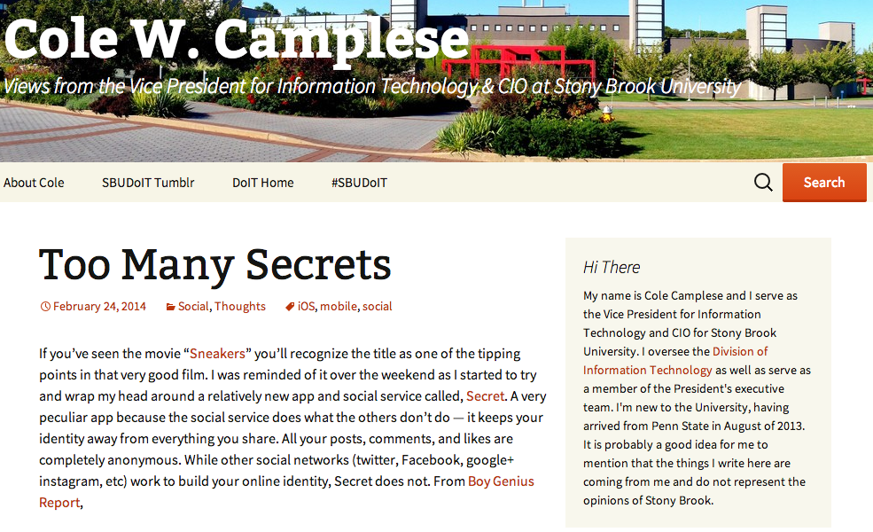
Desktop/Laptop View
When viewing on a device with a large screen (desktop or laptop), the site shows information in two columns and the full menu across the top:
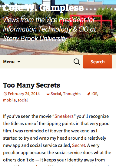
Mobile Device View
When viewed on smaller screens, like tables or mobile devices, everything is displayed in one long column and the menu is collapsed into a drop down: